The Brief

Quake, Lisbon's Interactive Earthquake Museum, aims to tell the devastating story and impact of the 1755 Lisbon earthquake - the most destructive earthquake to ever hit Europe - and to increase earthquake awareness in Portugal. Even though Portugal is geographically very close to a fault line, and there’s a startling high probability of another mega earthquake hitting the country, levels of education and preparedness are alarmingly low.

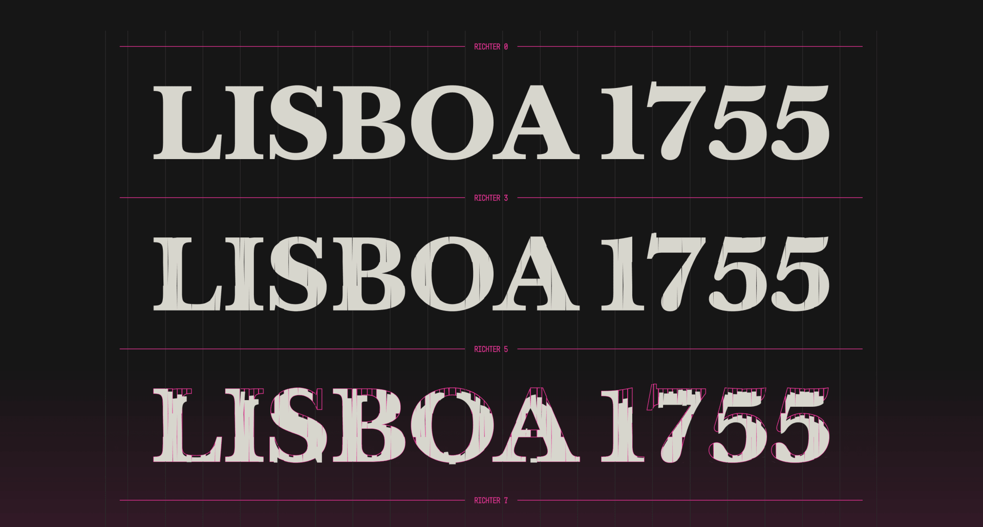
Quake, Lisbon's Interactive Earthquake Museum, created 1755 Quake, a typeface that visually simulates how buildings collapse under seismic forces. By using the typeface to dramatise educational and historical messages, the work communicates in a visually arresting and memorable way, that is much more likely to galvanise action in its audience.

1755 Quake Case 120s HIGH

The Idea

1755 is a typography designed by disaster, that scales not in weight, but in Richter. This font pushes boundaries by blending typography, architecture, data visualisation and seismic science. It surprises by transforming a static typeface into a dynamic simulation of buildings collapsing. And it becomes a powerful, egalitarian educational tool, as this proprietary typography is free to download and use for everyone.

Complement 02

The Challenge

The biggest challenge was making it as real as possible. For that, we worked with an architect and engineers to recreate how pre-1755 structures collapsed under seismic forces. Then, we translated that into the creation and destruction of each typographic character. This ensured that our message was not only easy to understand, but that it created an emotional response. After all, in order to genuinely change behaviours, we had to create a typeface that was both informative and engaging.

Please provide your contact information to continue.

Before submitting your information, please read our Privacy Policy as it contains detailed information on the processing of your personal data and how we use it.